Table of contents
Web font loading performance
A slow font load rarely shows up as "the fonts are slow" in your revenue report – but it absolutely shows up as users hesitating, mis-clicking, or bouncing because the page looks unfinished. On ecommerce pages, the difference between readable product info now vs. 2–3 seconds later can be the difference between add-to-cart and back-button.
Web font loading performance is how quickly your site can download, activate, and render custom web fonts without delaying visible text or causing layout shifts when fonts swap in. It's not a single universal metric; it's best understood by its impact on key outcomes like FCP, LCP, and especially CLS.
Fonts affect performance mainly through delayed text visibility (FOIT) and through reflow when the custom font swaps in (CLS risk).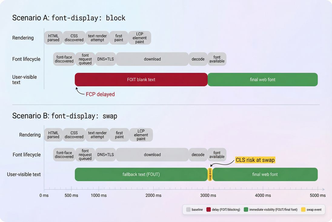
What this performance reveals
Font loading performance answers a few operational questions that matter to a website owner:
- Can users read key content immediately? If not, you'll see "blank" or late-appearing text (FOIT).
- Does the page visually "jump" when fonts arrive? That's a common, preventable source of layout instability and CLS.
- Are fonts on the critical rendering path? Fonts can become effectively render-blocking for above-the-fold text, just like render-blocking resources.
The Website Owner's perspective: If a user can't quickly read price, shipping info, or the primary CTA, you're paying for traffic that can't evaluate the offer. Font fixes aren't "design tweaks" – they directly affect whether the page looks trustworthy and complete.
How font loading works in practice
Browsers don't download fonts "because you referenced them." They download fonts because a rendered element actually needs glyphs from that font.
A simplified lifecycle:
- Browser downloads HTML.
- Browser discovers CSS (external or inline).
- CSS contains
@font-facerules (font URLs). - Browser builds the CSSOM and starts layout.
- When text needs the font, the browser requests the font file.
- The font is downloaded, decoded, and activated.
- Text is rendered with the custom font (either immediately or after a fallback phase).
What "calculation" looks like
Since there's no single standard "font metric," teams typically reason about three measurable durations:
- Font request start delay: time lost before the font request even begins (often caused by late CSS discovery, missing preconnect, or slow TTFB on the font host).
- Font transfer + decode time: download duration + time to decode the font on the device.
- User-visible impact window: how long the user sees blank text (FOIT), fallback text (FOUT), or a layout shift at swap.
In lab tools, you infer this from the network waterfall and paint events. In the field, you usually track the effects (LCP/CLS changes, conversion changes) rather than "font time" directly – unless you add custom instrumentation.
The key control: font-display
font-display tells the browser what to do while the font is loading:
block: hide text briefly (risk FOIT), then swap to web font.swap: show fallback immediately, swap when ready (risk CLS).optional: like swap, but the browser may skip downloading on slow connections; great for performance, but you must accept that some users never see the custom font.fallback: a shorter block period thanblock, then fallback.
A common safe starting point is:
@font-face {
  font-family: "MyBrand";
  src: url("/fonts/mybrand.woff2") format("woff2");
  font-display: swap;
}
But "swap" alone doesn't solve layout shift – you also need to manage font metrics (more on that below).
Where fonts break real pages
1) FOIT: invisible text
FOIT happens when the browser decides it should wait before showing text because the font might arrive soon. The result is a page that feels "stuck," even if images and layout appear.
Common causes:
- CSS with
@font-faceis discovered late (not in critical CSS) - Font files are large (multiple weights/styles)
- The font host is slow (extra DNS lookup time, TLS handshake, or origin latency vs a CDN)
- Missing
font-display(browser default behavior varies)
Business impact: users perceive a broken page – especially damaging on landing pages and PDPs.
2) FOUT + CLS: fallback first, then jump
With swap, you avoid invisible text, but you can get a visible "jump" when the real font arrives. That's usually CLS.
Why it happens: fallback fonts and your web font have different letter widths, x-height, and line breaks. When the swap occurs, paragraphs reflow and elements move.
This is one of the most common "mysterious CLS" sources on ecommerce sites: product titles wrap differently, review stars shift, filter chips move, and the CTA jumps.
3) LCP delays from late font availability
If your LCP element is text (headline, hero banner text, price block), fonts can delay when that element is considered "done" painting. Even when LCP is an image, font work can still compete for bandwidth and main thread time, especially on mobile.
To understand LCP better, see LCP and the critical rendering path.
The Website Owner's perspective: If LCP gets worse after a redesign that "only changed typography," it's not a mystery. New weights, third-party font hosting, and missing preloads can easily add hundreds of milliseconds to above-the-fold completion.
How to measure font issues fast
Start with symptoms in Core Web Vitals
Fonts rarely show as a single line item in executive dashboards. Instead, you notice:
- Higher CLS on pages with lots of above-the-fold text
- Higher LCP when your hero is text-heavy
- Lower conversion after typography or branding changes
Use both lab and field views:
- Lab tests explain "why" (what request started late, what was large).
- Field data confirms "how often" real users are affected. See Field vs lab data and CrUX data.
Use the network waterfall to see reality
In a waterfall, font problems look like:
- Font requests starting late (after render/layout)
- Multiple font files downloading in parallel with critical images/JS
- Fonts coming from a different origin with no warm connection
- Missing caching (fonts re-downloaded too often)
If you use PageVitals, the Network Request Waterfall report makes this easy to spot: /docs/features/network-request-waterfall/.
A waterfall makes font waste obvious: late-starting font requests and extra connection setup are common root causes of text delays.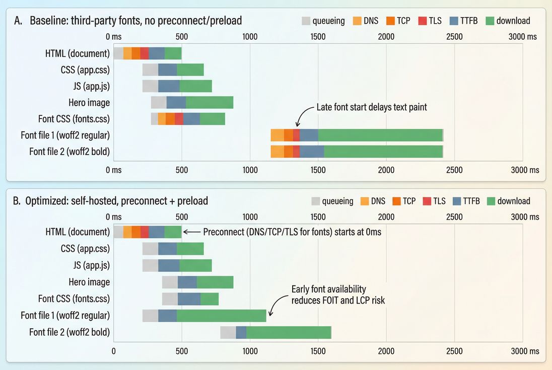
Quick checks that catch most font problems
- Count font files used on a typical page
- If you see 8–20 font files, you're almost certainly paying a visible cost.
- Check file formats
- Prefer WOFF2. If you still ship TTF/OTF to browsers, you're wasting bytes.
- Check caching headers
- Fonts should be long-lived cached. See Browser caching and Cache-Control headers.
- Check cross-origin visibility
- If fonts are hosted on another domain, ensure the right CORS headers and consider
Timing-Allow-Originif you want reliable timing data.
- If fonts are hosted on another domain, ensure the right CORS headers and consider
Benchmarks and decision thresholds
These aren't universal "pass/fail" numbers, but they're useful for making decisions quickly.
| What to check | Healthy range (typical) | When to act |
|---|---|---|
| Font families on a page | 1–2 | 3+ families used above the fold |
| Font files (weights/styles) | 2–6 | 8+ files, or many weights for body text |
| WOFF2 total transfer (first view) | ~50–200 KB | 300 KB+ just for fonts |
| Caching for fonts | 6–12 months | Short TTLs, re-downloading often |
| CLS from font swap | ~0.00–0.02 | CLS spikes on text-heavy templates |
The Website Owner's perspective: Typography is a brand decision, but the number of weights and where they're used is a performance decision. You don't need to remove your brand font to get fast – you need to be intentional about where it earns its cost.
Fixes that actually move the needle
1) Reduce font payload first
Most font wins come from shipping fewer bytes and fewer files.
Practical steps:
- Remove unused weights and styles (e.g., keep 400 and 700; avoid 100/200/900 unless truly necessary).
- Use a variable font when it replaces multiple separate files. One variable font can sometimes replace 6–10 static files.
- Subset fonts to only the glyph ranges you need (especially for Latin-only sites). If you serve multiple languages, use
unicode-rangeto load subsets per language.
This is similar in spirit to unused CSS and unused JavaScript: unused fonts are pure overhead.
2) Make the most important font available earlier
If above-the-fold content uses a specific font file (often "regular" or "semibold"), preload just that file.
<link rel="preload"
      href="/fonts/mybrand-latin-regular.woff2"
      as="font"
      type="font/woff2"
      crossorigin>
Guidelines:
- Preload 1 font for most pages; preloading many can backfire by competing with critical images/JS.
- Pair preload with a good caching strategy so repeat visits are nearly free.
- Learn more about request timing controls in Preload and connection warm-up in Preconnect.
3) Stop invisible text
Ensure font-display is set deliberately:
- If your priority is "readable immediately," prefer
swaporoptional. - If your brand requires the custom font, still avoid long blank text; use
fallbackorswapand address layout shift with metrics tuning.
4) Prevent CLS from font swaps
To reduce reflow when swapping from fallback to web font:
- Choose metric-compatible fallback fonts (similar width and x-height).
- Use CSS font metric overrides (supported in modern browsers):
size-adjustascent-overridedescent-overrideline-gap-override
Example pattern:
/* Fallback that better matches your web font metrics */
@font-face {
  font-family: "MyBrand Fallback";
  src: local("Arial");
  size-adjust: 102%;
  ascent-override: 90%;
  descent-override: 22%;
  line-gap-override: 0%;
}

body {
  font-family: "MyBrand", "MyBrand Fallback", system-ui, -apple-system, "Segoe UI", sans-serif;
}
You'll need to tune values per font, but the payoff can be huge: readable text immediately and minimal CLS.
For broader CLS context, see Zero layout shift and CLS.
5) Remove third-party connection overhead
If fonts come from a third-party origin, you often pay:
- extra DNS + TCP + TLS setup
- inconsistent caching behavior across environments
- less control over preloading
Options:
- Self-host fonts behind your own CDN (CDN performance, Edge caching)
- If you must keep third-party hosting, at least add:
preconnectto the font origindns-prefetchas a mild hint (DNS prefetch)
6) Cache fonts aggressively (and correctly)
Fonts are ideal for long-lived caching because they change rarely.
Typical approach:
- Filenames with hashes:
mybrand-regular.ab12cd.woff2 - Headers:
Cache-Control: public, max-age=31536000, immutable
This reduces repeat-visit cost and stabilizes performance across navigations. See Effective cache TTL for how to interpret whether caching is working in practice.
7) Keep CSS discovery early
Fonts don't start until the browser finds your @font-face. If your font definitions are buried in non-critical CSS that loads late, the browser can't even begin.
Combine:
- minimal critical CSS for above-the-fold (Critical CSS)
- defer non-critical CSS loading where appropriate
- avoid blocking the render path with unnecessary resources (Render-blocking resources)
Choosing a font strategy that fits the business
Different sites should make different choices. Here's a straightforward decision table:
| Strategy | When it's best | Performance profile | Brand consistency |
|---|---|---|---|
| System fonts only | Content sites, speed-first landing pages, MVPs | Fastest, simplest, lowest risk | Lowest (but can still look great) |
| Brand font for headings only | Ecommerce, SaaS marketing pages | Usually excellent; limits font payload | High impact where it matters |
| Brand font for all text | Brand-driven sites, editorial | Requires careful engineering | Highest, but highest risk |
font-display: optional | Mobile-heavy audiences, global traffic | Great for speed under slow networks | Some users may never see brand font |
Font strategy is a tradeoff: you're balancing how quickly key text becomes final (LCP risk) against how much it moves when fonts swap (CLS risk).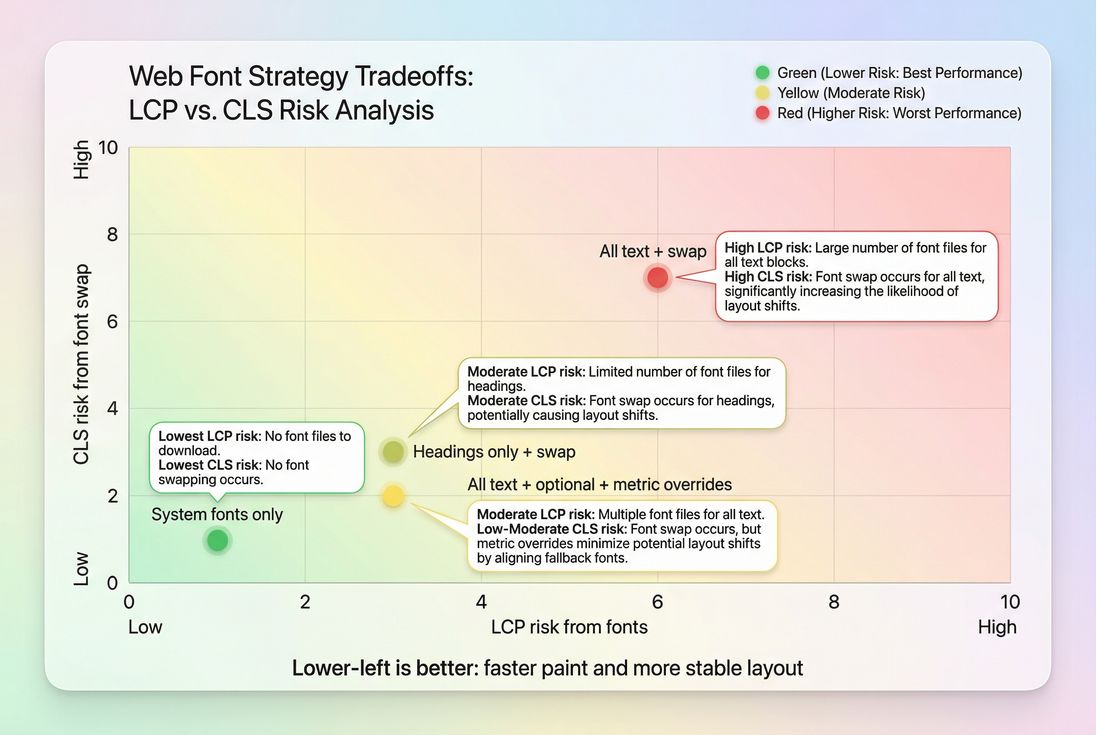
The Website Owner's perspective: Your goal isn't "perfect typography on every device at any cost." Your goal is "a page that looks credible immediately." Many high-performing stores use brand fonts selectively (headings) and keep body text stable and fast.
How to interpret changes after you optimize
When font work is effective, you should typically see:
- CLS decreases on templates where text shifts were happening (PDPs, PLPs, landing pages).
- LCP improves when the hero headline or major text block was previously waiting on fonts.
- FCP and Speed Index improve because readable content appears earlier (even if the final font arrives later).
If you don't see improvements:
- You may have fixed the wrong page state (e.g., logged-in vs logged-out).
- Fonts may not be the limiting factor; large images, JS execution, or server latency may dominate. Check JS execution time, TTFB, and HTTP requests.
- You may have improved lab results but not field results due to caching differences, traffic mix, or regional latency. Revisit Field vs lab data.
A practical checklist for busy teams
If you want the "80/20" plan:
- Inventory: list all font files loaded on top templates (home, PLP, PDP, checkout).
- Cut: remove unused weights/styles; consider variable font.
- Control behavior: set
font-display: swap(oroptionalif acceptable). - Stabilize layout: use metric-compatible fallbacks and consider
size-adjust. - Start early: preload the single most critical WOFF2 file.
- Cache hard: long-lived caching with immutable hashed filenames.
- Verify: confirm in a waterfall and confirm CLS/LCP changes in real users.
If you need a structured way to validate improvements in test runs, PageVitals' Lighthouse tests and waterfalls are documented here: /docs/features/lighthouse-tests/ and /docs/features/network-request-waterfall/.
Fonts are one of the few performance areas where you can dramatically improve perceived speed without changing any "features." Done right, you get brand typography and fast, stable pages – no blank text, no jumping buttons, and fewer abandoned sessions.
Frequently asked questions
A practical target is that text should appear immediately (no blank text) and any custom-font swap should feel subtle. In lab tests, aim for the first font file to finish downloading before FCP on fast pages, and within about 1 second on mobile-like throttling. Also aim for near-zero CLS from font swaps.
Self-hosting is often faster and more controllable because you can cache aggressively, reduce DNS and TLS handshakes, and preload precisely. Third-party font CDNs can still be fine, but they add connection overhead and can hide timing details. If you use third-party hosting, add preconnect and verify caching headers.
As a rule of thumb, keep it to one family with 2–4 files (regular and bold, maybe italic) for above-the-fold content. Each extra weight or style is usually another request and download. If your design uses many weights, consider a variable font or limit custom fonts to headings only.
Fonts can shift layout when the page renders with a fallback font first and then swaps to the custom font with different letter widths and line heights. That reflows text, moving buttons and product details. Fixes include font-display tuning, choosing metric-compatible fallbacks, and using CSS size-adjust and related overrides.
The fastest wins are typically setting font-display to swap or optional to avoid invisible text, preloading the single most critical font used above the fold, and reducing font file count by removing unused weights. If third-party fonts are slow, self-hosting plus long-lived caching is often the next biggest step.
Want to take PageVitals for a spin?
Page speed monitoring and alerting for your website. Get daily Lighthouse reports for all your pages. No installation needed.
Start my free trial