Table of contents
Image optimization best practices
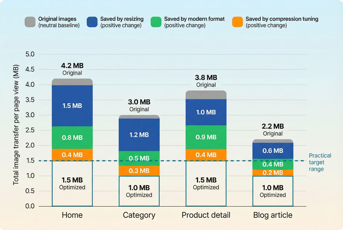
Images are usually the biggest bytes on your pages. That makes them one of the fastest levers for improving mobile load time, protecting conversions, and avoiding expensive "site feels slow" complaints – especially on category pages and product detail pages where you load many thumbnails plus a large hero.
Image optimization best practices means delivering the right image (dimensions and format) at the lowest acceptable bytes, loaded at the right time, with stable layout and strong caching. Done well, it improves LCP (your "main content shows up" moment), helps prevent CLS, and reduces bandwidth and CDN/origin cost.
Which images to fix first
If you try to optimize every image everywhere, you'll stall. Website owners get the fastest results by prioritizing images that directly influence key user-perceived moments and templates.
Start with the LCP image
On many sites, the LCP element is an image (hero banner, featured product photo, large carousel slide). If that image is heavy, slow to discover, or deprioritized, LCP suffers.
Focus checks:
- Is the LCP image too large in dimensions (served at 2000px wide but displayed at 390px)?
- Is it a legacy format (JPEG/PNG) that could be smaller as WebP/AVIF?
- Is it lazy-loaded or injected late by JavaScript?
- Is it coming from a slow host (third-party, uncached, redirects)?
Related reading: Above-the-fold optimization and Critical rendering path.
The Website Owner's perspective
If your hero image is your LCP, optimizing it is often a direct conversion lever: faster first impression, faster product discovery, and fewer bounces from mobile shoppers on cellular connections.
Next, fix "death by thumbnails"
Category pages and search results often load dozens of images. Each one might be "small," but the total can overwhelm:
- Too many requests (HTTP requests)
- Too much total transfer
- CPU decode overhead on low-end phones
Your goal is not perfect quality on every thumbnail – it's "good enough" clarity at the smallest bytes.
Then, clean up hidden waste
Common sources of wasted image bytes:
- Retina overserving (always 2x/3x even when not needed)
- PNG used for photographs
- Original uploads served directly (camera photos, 4000px wide)
- Multiple carousels/sliders all loading immediately
How to right-size images
Right-sizing is usually the #1 image optimization win because it removes "invisible bytes" users never see.
What right-sizing really means
An image has:
- Displayed size: how large it appears in CSS (e.g., 360px wide)
- Delivered size: the actual pixel dimensions downloaded (e.g., 2000px wide)
- Device pixel ratio factor: many devices benefit from 2x sources (not always 3x)
If you deliver 2000px for a 360px slot, you pay for bytes that don't improve the visible result.
Use responsive images (properly)
Responsive images let the browser choose the smallest adequate file based on viewport and DPR.
- Use
srcsetwith multiple widths. - Use
sizesso the browser knows how wide the image will be in the layout. - Use
<picture>when you need format switching (AVIF/WebP fallback).
If you want the deeper mechanics and patterns, see Responsive images.
Practical srcset guidance for commerce:
- Product grid cards: 200w, 320w, 480w, 640w (most sites don't need more)
- Hero images: 640w, 960w, 1280w, 1536w, 1920w (depending on layout)
- Keep the number of candidates reasonable; each additional variant increases storage/processing complexity.
Beware the "sizes omitted" trap
If you provide srcset but omit (or misstate) sizes, browsers often assume the image will be full viewport width and download a larger candidate than necessary – especially painful on mobile.
Don't confuse "retina" with "always ship 2x"
A common compromise:
- Default to ~1x candidates for most thumbnails and non-critical images.
- Provide 2x where it matters (PDP gallery, zoom entry image, hero).
- Avoid 3x unless you have a clear visual requirement.
Which formats and compression to use
Format choice determines how efficiently you represent the same visual information.
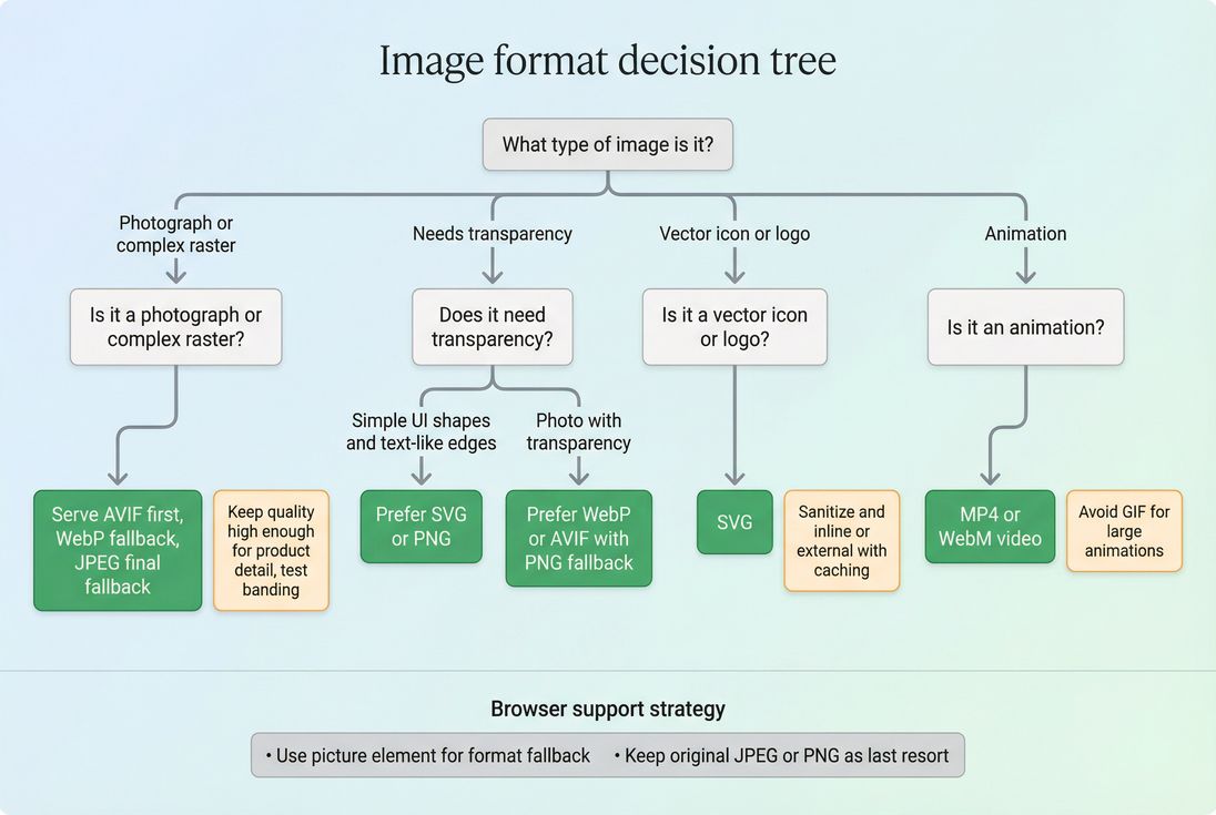
Choose formats based on content type
Use this as a starting point:
- Photos (products, lifestyle): AVIF (best) or WebP, fallback to JPEG
- UI graphics with transparency: PNG or WebP (sometimes AVIF), or SVG if vector
- Logos and icons: SVG (usually best)
- Animations: prefer video (MP4/WebM) over GIF when possible
More detail: WebP vs AVIF and Image compression.
Compression is a business decision (quality vs bytes)
Compression isn't "maximize quality" or "minimize bytes." It's: minimize bytes while preserving the visual cues that sell.
Practical rules:
- Product detail images: keep textures and edges; avoid blotchy artifacts on labels and fabric.
- Thumbnails: compress aggressively; users need recognition, not detail.
- Background/hero photography: watch for banding in gradients (sky, studio backdrops).
A simple operational approach:
- Pick a few representative images (dark, bright, high detail, gradients).
- Test a small set of quality settings.
- Lock defaults per use case (thumbnail vs PDP vs hero).
- Periodically re-check after design changes.
The Website Owner's perspective
Customers don't abandon a purchase because your thumbnail is 92 quality instead of 78. But they do abandon when the page feels slow. Use quality where it affects trust (PDP), and chase bytes where it doesn't (lists and supporting images).
Don't ignore decode and rendering costs
Even if transfer size is small, very large pixel dimensions can cost CPU to decode and render, hurting smoothness and responsiveness (related to INP indirectly through main-thread contention). Right-sizing helps here twice: less network, less CPU.
How to load images without breaking LCP
A lot of "image optimization" work fails because the bytes are smaller but the browser still loads the image late, or layout shifts when it appears.
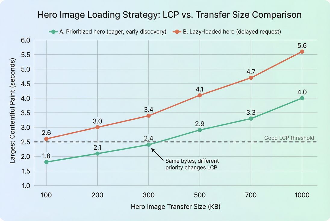
Protect the LCP image (do not lazy load it)
For the image that is likely to become LCP:
- Do not use
loading="lazy". - Ensure it's discovered early in HTML (not injected late).
- Consider priority hints and preloading when appropriate.
Good supporting concepts:
In practice, the biggest LCP image problems are:
- Carousels that load the first slide as a background image in CSS
- Hero images loaded after JS renders
- Lazy-loading everything by default
Lazy load the rest (carefully)
For below-the-fold images:
loading="lazy"is usually a net win.- Avoid JS-heavy lazy-loading libraries unless you truly need features.
- Watch out for "lazy loading above the fold" on short screens (some mobile viewports are smaller than you expect).
Also, lazy loading can increase request bursts later during scroll. That's typically acceptable, but on image-heavy pages it can cause jank if decode work spikes. If you see issues, reduce pixel dimensions further and consider staggering.
Prevent CLS from images
Images cause layout shift when the browser doesn't know how much space to reserve.
Fixes:
- Always include
widthandheightattributes (or CSSaspect-ratio) so the browser can reserve space. - Avoid swapping to a different aspect ratio after load (e.g., responsive art direction without stable sizing).
- Be careful with client-side image placeholders that change height.
More: Layout instability and Zero layout shift.
How to cache and deliver images well
Once you've shrunk images and loaded them correctly, caching and delivery makes sure you don't pay the cost repeatedly.
Use long-lived caching for versioned URLs
Best practice for static images:
Cache-Control: public, max-age=31536000, immutable- Use versioned file names (hashes or version query strings you actually change on updates)
If your cache headers are weak, every repeat visitor (and every multi-page session) re-downloads images, inflating both load time and bandwidth cost.
See: Browser caching, Cache-Control headers, and Cache TTL.
Deliver from the edge
Serving images from a CDN reduces latency and improves throughput, especially on mobile.
Related reading:
Operational checklist:
- Avoid redirects on image URLs.
- Ensure HTTP/2 or HTTP/3 where possible (HTTP/2 performance, HTTP/3 performance).
- Separate cookie-heavy domains from static assets when feasible (cookies increase request bytes).
- Confirm correct
Content-Typeand compression settings on the server side (not for already-compressed formats like AVIF/WebP, but for SVG and text assets).
The Website Owner's perspective
Image caching and CDN delivery is "profit protection." It reduces repeat-load time for returning shoppers, lowers bandwidth bills, and prevents performance regressions when traffic spikes (promotions, email campaigns, seasonal launches).
How to measure results and avoid regressions
Image work should show up in both lab and field data – but not always immediately.
What to track (and what changes mean)
Tie image changes to outcomes you actually care about:
| What you track | What it tells you | What a change usually means |
|---|---|---|
| LCP (LCP) | Main content speed | Hero image weight/priority improved or got worse |
| CLS (CLS) | Visual stability | Missing dimensions, placeholders, or late-loading media |
| Total image transfer (per page) | Bandwidth and load pressure | Resizing/format/compression is working (or not applied) |
| Image request count | Overfetching | Too many thumbnails, carousels, or duplicate assets |
| Cache hit behavior | Repeat-view speed | Cache headers and CDN configuration are correct |
To understand why lab and field differ, see Field vs lab data and Measuring Web Vitals. For external validation, PageSpeed Insights is useful, and CrUX data helps you interpret real-user trends.
Debug with a waterfall and LCP identification
When an image change "should have helped" but didn't, the culprit is usually:
- wrong image still being selected (bad
sizes) - late discovery (JS rendering, background images)
- priority inversions (lazy load, low priority)
- caching not effective
If you use PageVitals, the Network request waterfall view is designed for this kind of root-cause work: /docs/features/network-request-waterfall/.
For field monitoring of LCP specifically, see the docs for the LCP report: /docs/features/field-testing/web-vitals/lcp-report/.
Add performance budgets for images
Image regressions are common: a designer uploads a new hero, a plugin changes thumbnail sizes, a CMS starts serving originals.
Budgets help you catch that early. If you use PageVitals, review Performance budgets: /docs/features/budgets/.
A practical budget approach for image-heavy templates:
- Budget the LCP image transfer size (e.g., keep under 250 KB on mobile)
- Budget total image transfer per template
- Budget image request count on category pages
Common mistakes that undo image gains
A quick "don't do this" list that shows up constantly in audits:
- Lazy-loading the hero/LCP image (LCP gets worse even if bytes are smaller)
- No
width/heighton images (CLS spikes) - Using CSS background images for critical content (harder to preload and prioritize)
- Uploading originals and relying on CSS scaling
- Serving PNG for photos (often 2–10x larger than necessary)
- Forgetting caching (every page view pays the full cost again)
A practical rollout plan
If you want a low-risk sequence that typically delivers results in days, not months:
- Identify the LCP image on your top 3 templates (home, category, product).
- Right-size it to the maximum displayed size (plus reasonable DPR).
- Switch to modern formats with fallback (AVIF/WebP).
- Do not lazy load the LCP image; lazy load the rest.
- Add dimensions everywhere to eliminate image-driven CLS.
- Fix caching so repeat views are fast and cheap.
This sequence avoids the common trap of "we compressed images but LCP didn't move."
Related Academy guides
- Image optimization
- Image compression
- Responsive images
- Lazy loading
- Largest Contentful Paint
- Cumulative Layout Shift
Frequently asked questions
A practical starting target is under 1 MB total image transfer on key landing pages and under 1.5 to 2 MB on product detail pages, with the LCP image ideally under 150 to 250 KB on mobile. The right target depends on product imagery needs and traffic mix.
Convert photographic images where you get meaningful savings without visible artifacts. AVIF can be smaller than WebP, but encoding is heavier and rare cases decode slower on low end devices. A safe approach is AVIF with WebP fallback for photos, and keep PNG or SVG for UI graphics.
LCP often is the hero image. If you lazy load it, the browser delays fetching until after layout and some scripts run, pushing the render later. Fix by not lazy loading the LCP image, giving it high priority, and ensuring the correct responsive source is selected immediately.
Find the page LCP element and confirm whether it is an image, then check its request priority, transfer size, and whether it is being resized by CSS. Next identify the top image bytes by URL and check if they are uncompressed originals, missing srcset, or loaded off domain with poor caching.
Start with the top templates that drive revenue and SEO: homepage, category, and product pages. Fix the LCP image first by resizing and switching formats, then implement responsive images for listings, and finally add long cache headers. These steps usually reduce bounce and lift conversion fastest.
Want to take PageVitals for a spin?
Page speed monitoring and alerting for your website. Get daily Lighthouse reports for all your pages. No installation needed.
Start my free trial