Table of contents
Responsive images (srcset and sizes)
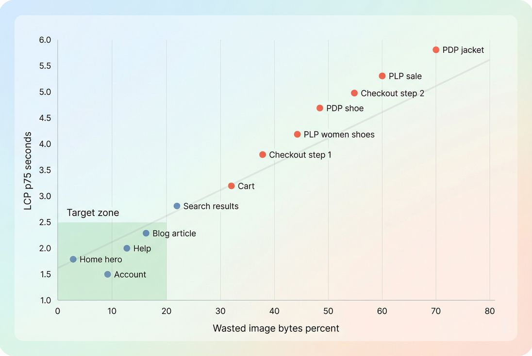
A surprisingly large share of "slow site" complaints comes down to one avoidable problem: customers on small screens downloading desktop-sized images. That wastes bandwidth you pay for, slows down key pages (especially product listing and product detail), and often drags down LCP – which can impact both conversion and search visibility.
Responsive images are the HTML patterns (srcset and sizes, sometimes picture) that let the browser choose the smallest image that will still look sharp for the user's current viewport and device pixel density.
What responsive images fix
Most sites don't have an "image problem." They have a mismatch problem:
- Your layout renders an image at (say) 360 CSS pixels wide on mobile.
- But the browser downloads a 2000px wide file because that's what you provided (or what it thinks it needs).
- The result: more transfer time, more decode time, and often slower rendering of above-the-fold content.
Responsive images fix this by letting the browser pick a candidate file based on:
- Viewport size (how wide the page is)
- Slot size (how wide the image will render in your layout)
- Device pixel ratio (DPR) (how many physical pixels per CSS pixel)
- Your offered image candidates (the
srcsetlist)
This is tightly connected to:
- Mobile page speed (because mobile is where over-downloading hurts most)
- Image optimization and Image compression (because you still need each candidate to be efficient)
- Above-the-fold optimization (because your LCP image is commonly a responsive image)
The Website Owner's perspective: If your product grid thumbnails are oversized, you're paying to ship pixels that don't increase sales. Fixing
srcset/sizesoften reduces image transfer on category pages dramatically – improving bounce rate from paid traffic and reducing CDN egress costs.
How the browser chooses a file
There are two main ways to write srcset:
- Width descriptors (
w) +sizes(best for most responsive layouts) - Pixel density descriptors (
x) (best for fixed-size images like icons or truly fixed slots)
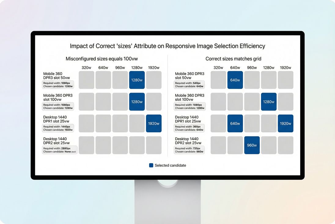
The practical calculation (no mystery)
When you use w descriptors, the browser effectively does:
required resource width ≈ rendered CSS width × device pixel ratio
Then it selects the smallest candidate in srcset that meets or slightly exceeds that requirement.
The key is: the browser needs the rendered CSS width estimate up front. That's what sizes supplies.
Example: product card image in a grid
Let's say your product listing page shows 2 columns on mobile and 4 columns on desktop.
A good pattern looks like:
<img
  src="/img/shoe-640.jpg"
  srcset="
    /img/shoe-320.jpg 320w,
    /img/shoe-640.jpg 640w,
    /img/shoe-960.jpg 960w,
    /img/shoe-1280.jpg 1280w"
  sizes="
    (min-width: 1024px) 25vw,
    (min-width: 640px) 50vw,
    100vw"
  width="640"
  height="640"
  alt="Running shoe in blue"
/>
What happens:
- On desktop ≥1024px, the image slot is about 25vw (roughly one quarter of the viewport).
- On mid-size screens ≥640px, it's 50vw.
- Otherwise it's 100vw (common for single-column or full-bleed layouts).
Why missing sizes breaks everything
If you provide srcset with w descriptors but omit sizes, the browser uses a default assumption that is effectively 100vw for many cases.
That default is safe for quality, but expensive for performance – especially in grids where images are nowhere near full viewport width.
When to use 1x/2x instead
Use density descriptors when the rendered image size is essentially fixed in CSS (for example, a 48px avatar that is always 48px).
<img
  src="/img/avatar-48.png"
  srcset="/img/avatar-48.png 1x, /img/avatar-96.png 2x"
  width="48"
  height="48"
  alt="Customer avatar"
/>
This avoids guessing slot size entirely.
Where responsive images go wrong
Most responsive-image issues are not "browser quirks." They're predictable implementation mistakes that show up across e-commerce templates.
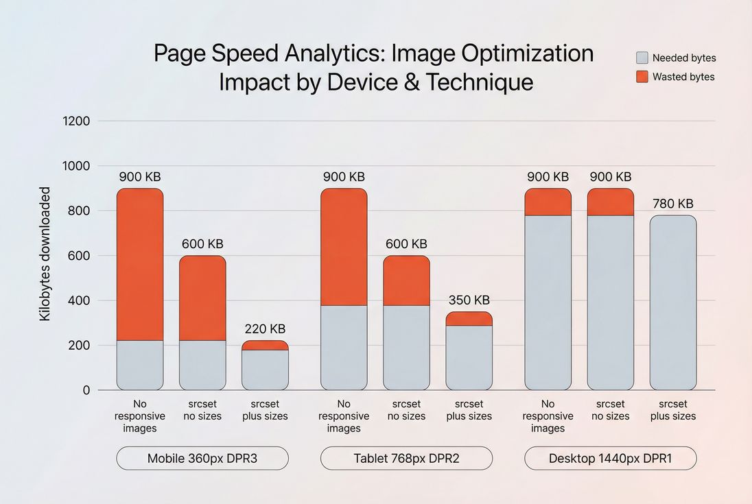
1) srcset without sizes (the silent bandwidth killer)
Symptom:
- Your HTML has
srcset="... 320w, ... 640w, ..."but nosizes.
Impact:
- The browser often chooses a larger candidate than your layout needs.
- Category pages (PLPs) become heavy because they contain many images.
Fix:
- Add
sizesthat reflects your real layout breakpoints.
2) sizes that doesn't match real CSS
Symptom:
sizes="100vw"everywhere, even for images inside a 3-column grid.- Or breakpoints that don't match your CSS grid changes.
Impact:
- Over-downloading on desktop or mobile.
- Inconsistent results across devices.
Fix:
- Derive
sizesfrom your actual layout rules (grid columns, container widths, max widths).
Tip: If your layout uses a centered container, consider sizes that reflect that max width, not pure viewport width.
3) Too few candidate widths
Symptom:
- Only 2 candidates (e.g., 400w and 1600w).
Impact:
- The browser is forced to "jump up" to the big file for many devices.
- You see large wasted bytes even though you did "use srcset."
Fix:
- Provide a reasonable ladder (example: 320, 480, 640, 768, 960, 1280, 1536).
- For key hero images, consider adding one more candidate around your most common required widths.
4) Wrong intrinsic width labels
Symptom:
- Your
srcsetsaysimage-640.jpg 640wbut the file is actually 1200px wide (or vice versa).
Impact:
- The browser's selection math becomes unreliable.
- You can get blurry images or over-downloading.
Fix:
- Ensure your image pipeline outputs true resized derivatives and labels them correctly.
5) Background images without a responsive strategy
CSS background-image does not use srcset. If your hero is a CSS background, you'll often ship a desktop image to everyone.
Fix options:
- Prefer an actual
<img>for content images. - Or use
image-set()for backgrounds (still not as flexible as<picture>and has footguns).
6) LCP images lazy-loaded by mistake
If your largest above-the-fold image is lazy-loaded, it may start late and hurt LCP even if your srcset/sizes are perfect.
Fix:
- Do not lazy-load above-the-fold hero/product images.
- Apply Lazy loading selectively to below-the-fold images.
How website owners should interpret changes
Responsive image work typically shows up as:
- Lower total bytes downloaded on mobile
- Faster rendering of key templates
- Better LCP consistency across device classes
- Lower variability in performance when marketing campaigns send spikes of mobile traffic
What it doesn't usually change much:
- TTFB (server response) unless you also change CDN/cache behavior
- JavaScript execution (different bottleneck)
Because this is a "bytes and timing" improvement, you should interpret changes through both:
- Lab tests (quick feedback for a template change)
- Field data (what real users experience)
If you need a refresher on how to reconcile those two, see Field vs lab data and Measuring Web Vitals.
The Website Owner's perspective: The win you're looking for isn't just a better Lighthouse score. It's smoother mobile shopping: faster category browsing, fewer abandonment spikes on cellular, and a more stable experience during promotions when traffic shifts heavily to mobile.
How to audit and benchmark responsive images
You're trying to answer two questions:
- Did the browser pick the right candidate?
- Is the chosen candidate efficiently encoded?
A practical audit workflow
Pick 3 representative templates
- Homepage hero
- PLP grid (category)
- PDP main product image
Test on 3 device classes
- Small mobile, high DPR (common real-world bottleneck)
- Tablet
- Desktop
Check three things for each key image
- Rendered size in CSS pixels (DevTools)
- Downloaded resource dimensions (Network panel)
- Transfer size (KB) and whether it's compressed efficiently (WebP vs AVIF)
If you use PageVitals, the Network request waterfall is the fastest place to confirm which image URL was chosen and how big it was on the wire.
Benchmarks you can actually use
These vary by industry and design, but the table below is a solid decision guide for most commerce sites.
| Image type (common) | What "good" looks like | What's usually wrong |
|---|---|---|
| PLP thumbnails | Candidate chosen is close to slot × DPR; minimal waste across many images | Missing sizes causing 2–4× pixels downloaded |
| PDP main image | Sharp on high-DPR phones without downloading desktop originals | Too few candidates (forces a huge jump) |
| Homepage hero (LCP) | Starts early, right-sized, modern format, not lazy-loaded | Lazy-loaded or background image with no responsive handling |
A simple "waste" heuristic
If the downloaded image width is more than ~1.5× what you need for the rendered slot (after accounting for DPR), you're likely over-downloading in a way that matters.
Example:
- Rendered slot: 360 CSS px
- DPR: 3
- Needed: ~1080 px
- Downloaded: 2000 px
That's a lot of unnecessary pixels (and usually unnecessary KB).
Implementation patterns that work
This is where teams usually get stuck: "We understand it – how do we roll it out without breaking design or workflow?"
Pattern 1: grid thumbnails (PLP)
Goals:
- Avoid 100vw assumptions
- Keep candidates small but sharp
- Reduce total requests/bytes across many cards (HTTP requests)
Guidance:
- Use
wdescriptors + accuratesizes. - Keep aspect ratios consistent and set
width/heightto prevent CLS. - Consider a moderate candidate ladder because PLPs amplify waste (20 thumbnails × extra 200KB each is painful).
Pattern 2: primary product image (PDP)
Goals:
- High quality where it matters
- Avoid shipping desktop originals to mobile
- Keep LCP stable (often the main image is LCP)
Guidance:
- Provide enough candidates to cover common DPRs.
- Use modern formats and compression (Image compression).
- Don't lazy-load the primary image above the fold.
- Consider preloading the LCP image on key pages (Preload) and ensure it isn't blocked by render delays (Critical rendering path).
Pattern 3: art direction with <picture>
Use this when you need different crops (not just different sizes).
<picture>
  <source
    type="image/avif"
    media="(min-width: 1024px)"
    srcset="/img/hero-desktop-1280.avif 1280w, /img/hero-desktop-1920.avif 1920w"
    sizes="(min-width: 1200px) 1200px, 100vw">
  <source
    type="image/avif"
    srcset="/img/hero-mobile-640.avif 640w, /img/hero-mobile-960.avif 960w"
    sizes="100vw">
  <img
    src="/img/hero-mobile-640.jpg"
    width="960"
    height="540"
    alt="Holiday sale hero banner">
</picture>
Notes:
- Keep
sizesaligned with each source's layout. - Combine with format selection best practices (WebP vs AVIF).
Pattern 4: caching the derivatives
Responsive images create more files. That's normal. Make it cheap:
- Set long-lived caching (Browser caching and Cache-Control headers)
- Serve via a fast CDN (CDN performance)
- Keep URLs immutable (fingerprinted) so you can cache aggressively
Pattern 5: avoid "responsive images" that still block rendering
Even perfectly sized images can be slow if:
- The server is slow (Server response time)
- The connection setup is slow (TLS handshake, DNS lookup time)
- The page is weighed down by blocking JS/CSS (Render-blocking resources)
Responsive images are high leverage – but they're one part of the chain.
A rollout checklist (safe and fast)
Use this to implement across templates without surprises:
- Start with LCP images (homepage hero, PDP primary image). Confirm LCP behavior improves in lab and field.
- Add
widthandheight(oraspect-ratio) everywhere to reduce CLS (Zero layout shift). - For
wdescriptors: always ship a matchingsizes. - Ensure candidate widths match real derivatives from your image pipeline.
- Add enough candidate steps to avoid big jumps.
- Keep above-the-fold images not lazy-loaded; lazy-load the rest.
- Combine right-sizing with format and compression (Image optimization).
- Re-check on real devices and with field data over time (Real user monitoring).
If you want a single "success signal," it's this: on mobile, your key templates should stop downloading desktop-sized images – and your LCP should become both faster and more consistent.
Frequently asked questions
Open a product page on mobile and desktop, inspect the image request in DevTools, and confirm the downloaded image dimensions closely match the rendered CSS size times device pixel ratio. If you see huge images (like 2000px wide) for small slots, your sizes is wrong or missing.
Aim for less than 10 to 20 percent wasted bytes on key templates like home, category, and product pages. Some waste is normal due to rounding and candidate gaps, but consistently downloading 2 to 4 times more pixels than needed is a direct hit to LCP and bandwidth costs.
Both matter, but they solve different problems. Compression and modern formats reduce every image file. srcset and sizes prevent downloading the wrong size in the first place. For LCP images, choosing the right size often saves more time than squeezing a few extra kilobytes.
The most common cause is a missing or incorrect sizes attribute. Without sizes, many browsers assume the image will render at 100vw, so they pick a much larger candidate than your layout needs. Another cause is offering too few candidates, forcing the browser to over-download.
If the crop or composition should change, use the picture element with media conditions to swap different crops, then still use srcset within each source. If only the size changes, stick with one image and use srcset plus sizes so the browser selects the best resolution automatically.
Want to take PageVitals for a spin?
Page speed monitoring and alerting for your website. Get daily Lighthouse reports for all your pages. No installation needed.
Start my free trial